Is anyone Home?
- Denise Pinto
- Jun 22, 2019
- 7 min read
Updated: Mar 16, 2021

My first client based project that was the end of our General Assembly UX Immersive course.
Time frame: 3 weeks
Team members: 4 (including myself)
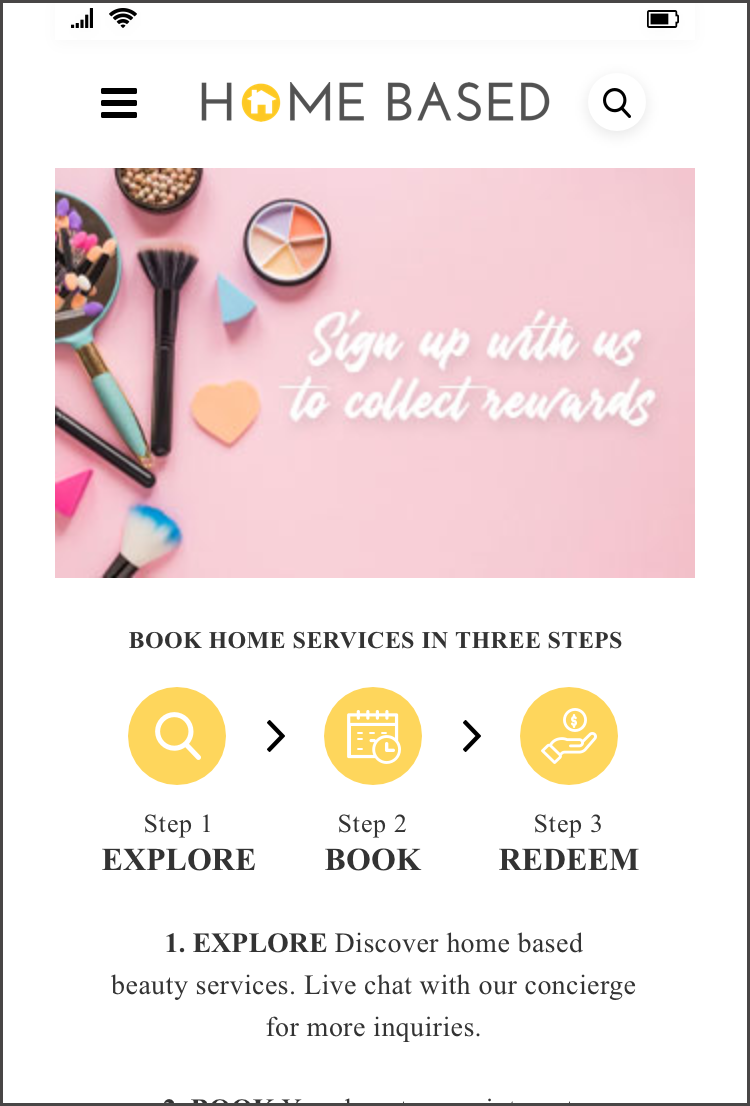
Homebased is a mobile-optimized platform that enables customers to easily discover and instantly book and pay for available services from their nearest home-based service. These services are provided by professionals such as manicurists and facialist, mainly found in the Sengkang and Punggol area.
Client’s brief
Homebased has a basic mobile-optimized website that allows customers to view listings, book services and make deposits via their WhatsApp concierge chat service. It was built according to early customer and vendor feedback and is in a state of optimization. The client believes that the user interface could be redesigned for a much smoother experience from searching to booking and payment. They are also open to the possibility of a complete overhaul as they are currently in the early stages of customer feedback, before they develop the mobile app by December 2019.
Not to be taken at face value
Was the problem just a User Interface problem or could there be more?
As UX designers, we should always dig deeper to find the root of the problem. We did so by first evaluating the UI problems by creating a user flow, conducting a heuristic evaluation and a competitive analysis.
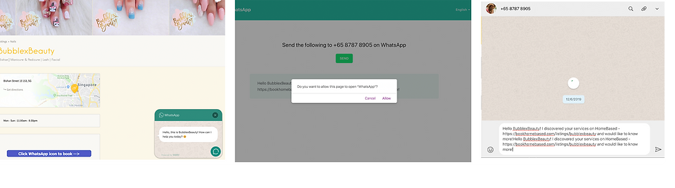
Problems with mobile website
1. Information given about the vendor and their services are varied (examples from two different vendors)


2. Misleading information. The What'sApp button on the same page serves different functions hence confusing the user.

3. There is no ‘about us’ section. Only the main header which gives a generic introduction to the page.

4. No explanation as to why certain vendors have a featured title.

5. Inconsistent use of buttons on the vendors listing page. Not all vendors have their addresses on the bottom right of each listing.

6. No onboarding about how to book services or the process of how to book with the respective vendor.
7. Customers are not able to see the dates and times of the slots available if they are interested to book, as the only means of booking is through the whatsapp button.
8. When clicking on the ‘all listing’ in the search section, there is no form of categorisation of the list of vendors.
Secondary Research
To understand the user experience, my teammates and I tried the services for ourselves. We acknowledge that we are not the users. We did this to gain a deeper understanding of the customer journey and craft our questions for our interviews with home based users more succinctly.
We then conducted interviews and contextual enquiries with homebased.sg users. Unfortunately our client was not able to get in touch with any of the users who had used the website to book their appointments.
Do what you can with what you have.
As homebased.sg users only visit the website once and never return for consecutive bookings, our success metric given by our clients is to:
- Convert 80% of home based service users to return to homebased.sg to make consecutive bookings.
Our clients provided some home based users from their list of vendors and we scouted for people who had used home based services as well. We had 10 users in total and conducted a contextual inquiry and interviews with the current mobile website. We consolidated our findings with a persona, customer journey and an affinity map.
Our findings
We learned that all of the interviewees contact the vendors directly via Whatsapp.
All the interviewees would only use homebased.sg to see for possible listing of vendors. Once contact with the vendors is made, they will not return to the app to make consecutive bookings.
Reviews, word of mouth recommendations, pricing and pictures are the top four priorities when deciding on a home based service.
Internet search, Instagram and word of mouth are the top three ways the interviewees search for home based services.
40% of the interviewees were put off with having to pay a deposit.
30% of the users preferred to pay for the services before it is rendered without paying the deposit while others prefered to pay after.
All interviewees are comfortable and prefer paying for their services electronically.
Interviewees were confused about the purpose of the whatsapp button and why it gets directed to the help desk or to the vendor.
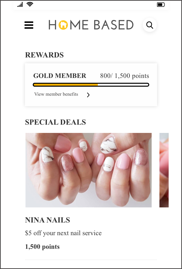
Integrating a booking system would not be a strong pull factor to get the potential users to come back to use the app. We needed a stronger pull factor. Going back to our competitive analysis, we saw that most competitors had a discount or a rewards system to retain customers.
Bearing in mind that our client is a start up and is in its infancy stage, we decided to check if they would be able to provide discounts for their users. Due to budget constraints, the client was only able to give a 3% discount. Nevertheless, we still included the rewards system to see if it would be sufficient pull factor.
Feature Implementation
1. Booking system
The removal of the WhatsApp button and the inclusion of a booking system will eliminate the confusion regarding the WhatsApp button. All users are tech savvy and are familiar with booking systems on various website and mobile platforms.
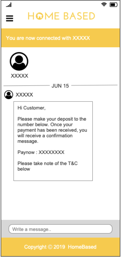
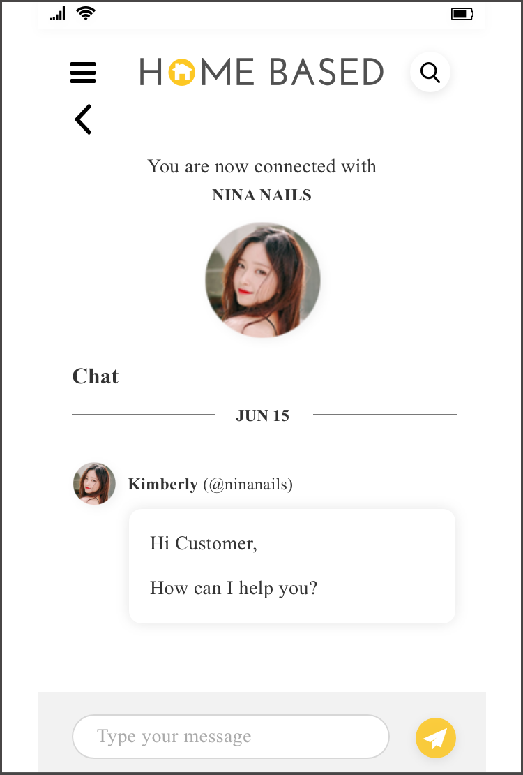
2. Message - in web/app
Users make enquiries with vendors without disclosing their personal number.
This also could be used as a platform to notify users on their booking reminders in future app development.
3. Rewards
To gain at least 80% retention rate, we aim to entice users to continue using Homebased.sg for their subsequent bookings.
1st Prototype


Instructing users how to book with homebased.sg, and attracting attention by increasing the size of the images.
As reviews are important, and users are price sensitive, we integrated a filtering system to find a service that is nearby to them with the price and reviews that they would want.
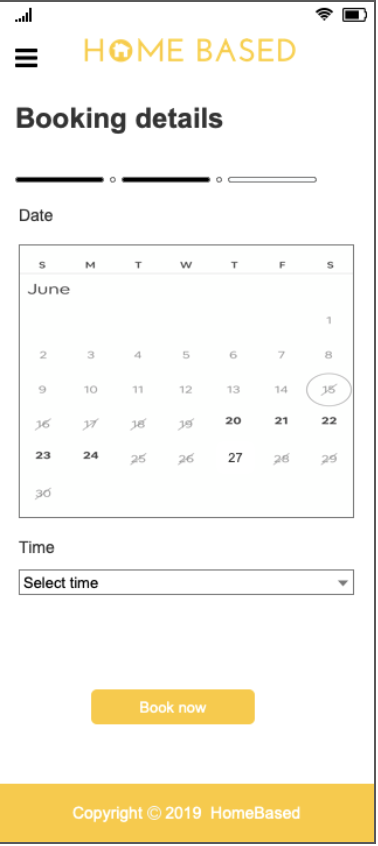
Users wanted to know the time and dates which the services are available so that they can plan their schedule.
Informing them of the reason for the deposit creates transparency and gains user trust.
What users liked
The new booking system reduces the hassle compared to the Whatsapp messaging. It was straightforward and easy to navigate.
The option of logging in through FB was convenient.
Things that could be improved
An “About” section to introduce the vendors
Users will book directly with vendors there is no incentive
Email confirmation for booking and sign up
No enquiries if they want more information about the services
Informing users of the deposit had no impact. Some users felt that after a few visits to the same vendor, trust should have been established and the deposit should be forgoed.
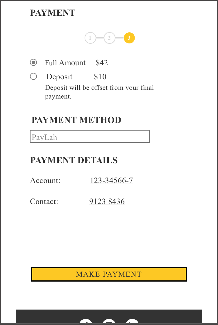
Final prototype


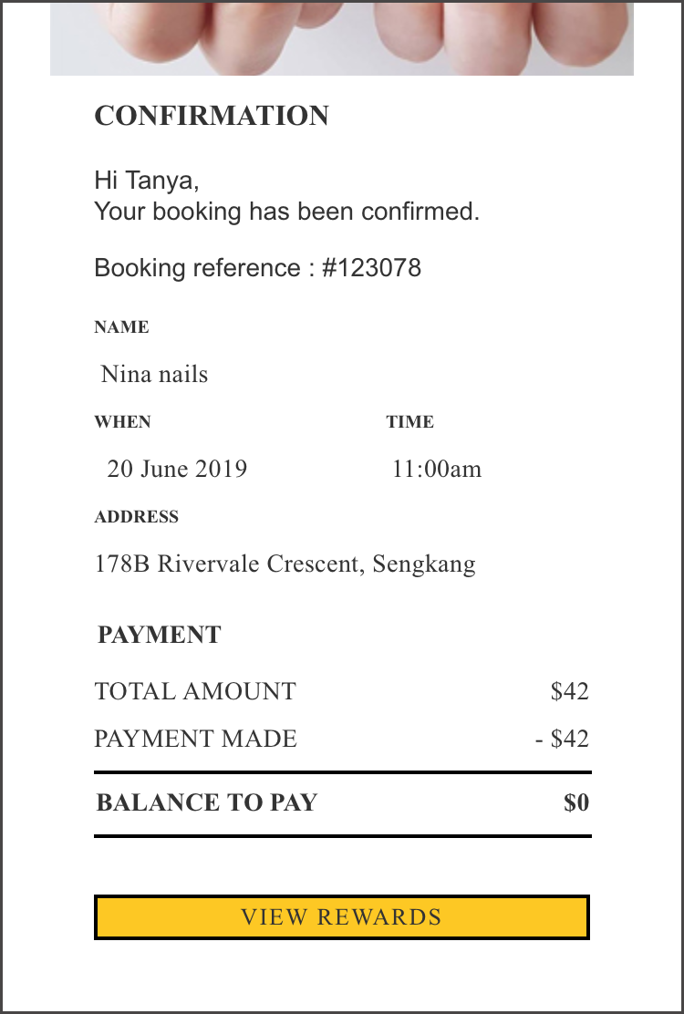


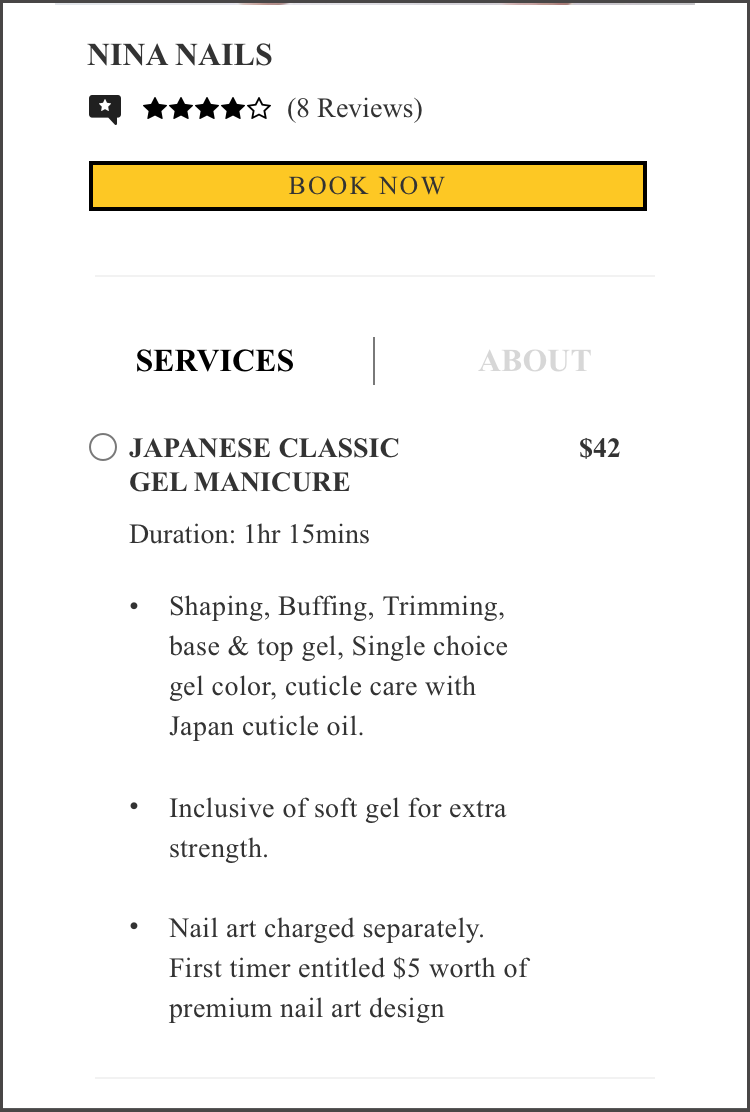
Vendors listing - has reviews, price range and photos of the services at a glance (gives users important information they want before clicking into the page)
Book now button is placed on top to grab user's attention and as an immediate call to action. 'About' section is provided as users wanted to learn more about the vendors.
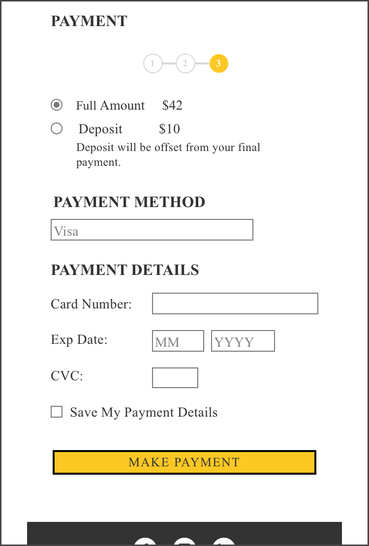
Users are given two choices if they would like to pay the deposit or pay in full.
Given wider range of payment methods as some users mentioned they would like to pay via credit card to rack up credit card points.
Different interfaces when paying via credit card/Paynow/Paylah.
Booking reference number and information about payment amount in the payment summary page.
Rewards section to inform users of what they can redeem with their current points.
Added an enquiry section in the hamburger menu, in case users would like to enquire about the respective services.
Measuring success
After each batch of interviews, we conducted a SUS test to measure our success as determined by our client which is to get 80% of the users to return back to the mobile website for consecutive bookings.


Additional Insights from interviewees
Deposits, rewards point system and 3% rebates
Comments on Deposits
"I prefer deposit because I might change the appointment date" (I can do nails another day if something important come by) "If it's cheaper to pay on the spot vs pay later, I don't mind paying upfront" (On deposit or full payment)
Comments on Rewards Point System
“Any form of incentives is useful, if not I will book directly with the vendor.”
“Able to explain how much to spend in order to redeem or get discounts using the point system?”
Comments on 3% Rebates
"3% rebates is very little but it's similar to LiveUp! I use LiveUp! And it does save a significant amount when I spent more."
“Rebates are better because I get to use it immediately as opposed to rewards point system”
Future Improvements
More listings and easy compare feature
Special deals for first timers
A reminder feature
Avatar for users to beautify - like a reflection of the users (app)
Final Thoughts
Lastly, I would like to thank my teammates for all their help. It was truly a pleasure working with them. We celebrated our wins and we picked each other during the tough times. I was also fortunate to have clients who were open to our suggestions and encouraged us to be open and honest with any feedback.

I felt I could have done better for this project. I felt that we could have dug deeper to solve the problem as to why the homebased.sg users did not return to the site but I did not know how. As Steve Jobs so aptly put “Get closer than ever to the customer, so close that you tell them what they need well before they realise it themselves.” The only solution I had was to do the best with what you have. I’m still a novice UX designer. I look forward to learning and honing my craft so well that one day I can give the users what they need without them realising it.
A testimonial from my client, Jerry:
It was a great pleasure working with Denise. She’s a masterful UI/UX designer who knows how to conduct business in a professional and timely manner, and always delivers ahead of the deadline. On top of that, she took the extra time and effort to get to know the industry so intimately that she is able to add tremendous value. I’d recommend Denise without hesitation.


Comments